Overview:
- Quant Fact Prediction Update (now 66-38, or 63.5%).
- And a look at analysis, probabilities & models.
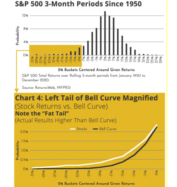
Many occurrences in nature, science, and business can be described by the bell curve or standard normal distribution. The chart below (from one of my papers) shows quarterly stock market returns graphed — and how the graph looks like a bell curve. However, upon closer inspection, you can see that things are not quite what they seem.
The edge of the curve is wider, or fatter, than the bell curve. That is, investment returns actually exhibit more occurrences at the tails than the bell curve would predict. The bottom half of the chart zooms in on the tail of stock market graph. This behavior is referred to as fat-tails and reflects the fact that we get larger moves to the downside (crashes) and upside than expected by statistical models.
Read more here:
https://carltonchin.substack.com/p/a-tale-of-two-charts-quant-facts
